Redesigning Parking Meter
Shopify Challenge: Parking Meter Redesign - Paying for parking shouldn't be difficult
Client:
-
Role:
Digital Designer
Year:
2021
I. Discovery
Design Brief
Inspiration from a well-known Shopify Design Challenge - I did this challenge to practice the design thinking process. A parking site needs a design for a parking meter interface. Its purposes are for drivers to pay for their parking spot within a specific timeframe, and for the parking attendant to check if there are any unpaid or expired parking.
Design Constraints
the machine has a single touchscreen - not any pinch and zoom, hard press or advanced touchscreen functionality supported
parking meters can accept credit card payments, but they are not connected to the internet and are not Bluetooth-enabled
Product Definition
What does a parking meter do?
The meter is used to provide tickets for drivers to validate that they have paid for the parking spot for a certain duration. Parking meter usually accepts credit card and coins as payment method.What is the users' goal in using the meter?
Drivers: to pay for the parking spot without getting a penalty.
Attendant: check if there's an unpaid / expired ticket for the occupied spot.What information / action does the meter need to obtain?
Collect payment method (insert a credit card or coin),
Available time slot & available parking spot
Print ticket
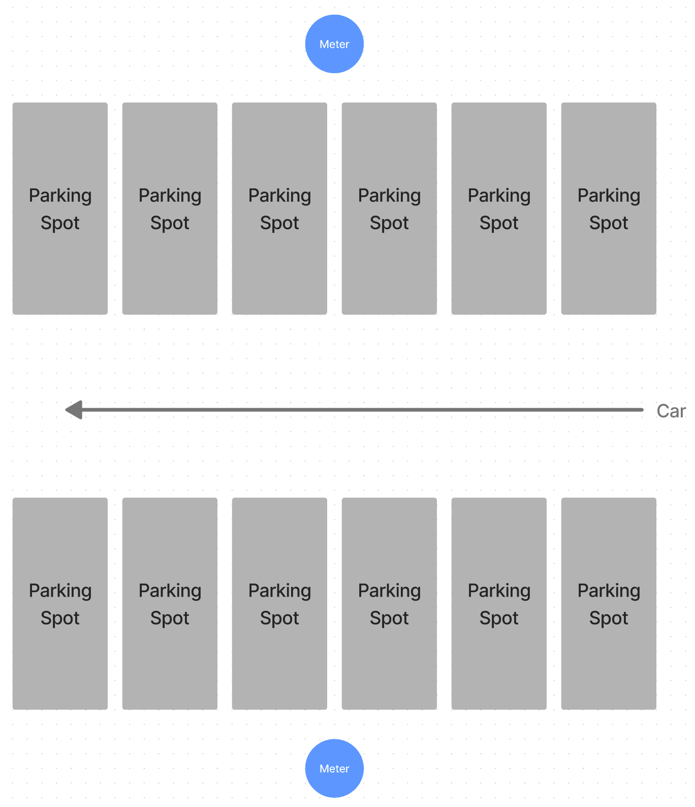
Understanding the parking site
According to the design brief, there will be one parking meter in every 6 parking spots. The parking attendant will check the meter to see if there's any expired or unpaid parking. I have included the visualization of the site layout to help me better understand the users' journey - drivers & parking attendants.
II. Research
Research Objectives
Find out the user flow for drivers & parking attendants when using the parking meter
Identify if there are any existing problems with the drivers & parking attendant
Figure out what pain points our users are experiencing
Methodologies
Site observation
Interview driver or parking attendant
Secondary research if needed
General Interview Questions
Can you tell me about your recent street parking experience?
Was it a positive or a negative experience?
What is positive or negative about your experience?
III. Ideation
What did I learn from the interview?
Most drivers have switched to using the parking mobile app for the following reasons:
Payment method - saved credit card information on the app, hygiene reasons, they don't carry coins anymore
Clearer instructions - they don't have to spend so much time finding parking information & rates, lack of instructions on an analogue screen
More user freedom - options are not restricted due to keypad and buttons on the machine

Most users found the flow of the first machine is not intuitive - what they see is Screen > Coins > Card > button > instructions.
They will have to scan the whole machine before they spot the instructions on the machine.
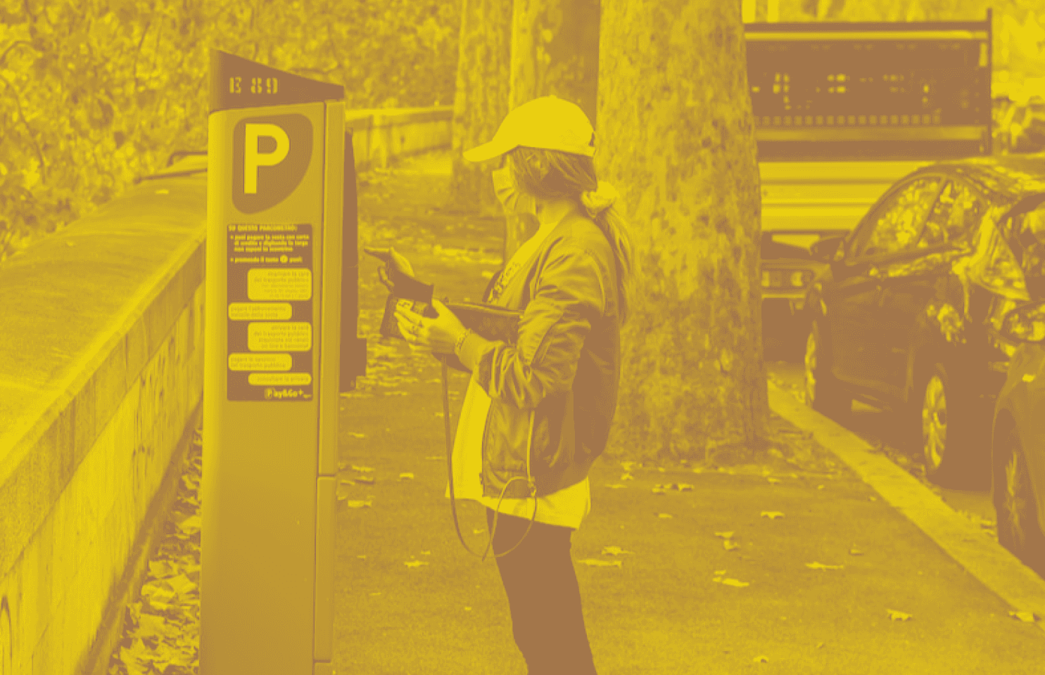
The Problem
Most drivers ditch physical parking meter because it has very limited selections on the panel and is difficult to look for information, including parking rates (usually not close to the machine) and instructions to use the machine.
Also, the analogue screen on the parking meter is not easy to read and it doesn't show the status of where the user is at.

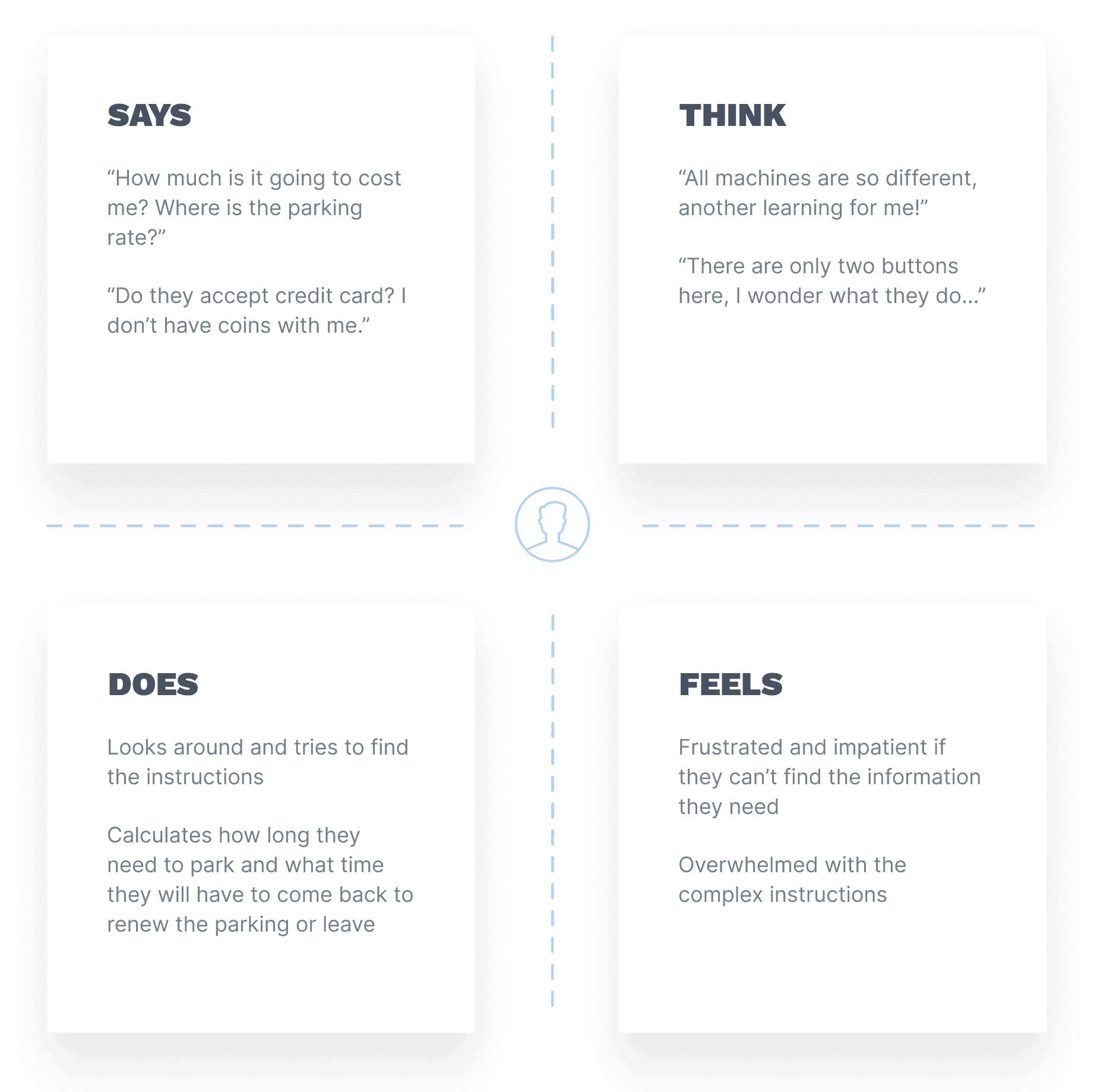
I utilized user journey to outline drivers' states and actions, including their feelings and thoughts which can help identify opportunities to ease their pain throughout the whole parking experience.
User Task - What do they need to do?

IV. Sketches
Driver Screens

Parking Attendant Screens

V. User Testing
Usability Testing (Lo-fidelity)
Before I went ahead and designed the interface, I gave these screens to drivers to test if they were as useful as intended and see how logical the flow is for drivers to use.
Here's the summary:
No system status - 'I wish I would know the whole process.'
Lack of command buttons - 'I can only click next? Can I go back?'
Crowded space on the right-hand side to work around
Options to select parking rate are unclear - 'I don't know which one I should choose, does the time change automatically when I adjust the [hour(s)] option?'
VI. Prototyping
UI Design for drivers
Most interviewees mentioned they liked the mobile app is that they can select a specific time and the machine will automatically calculate the price for them - Users can select either entering how long they want to park for OR when they want to park until
I kept the design plain and simple - mid-fidelity without any branding influencing the interface
I used an iPad mini resolution of 744 x 1133 px, I left about 20-24 px for the status bar area on top and breathing room on the bottom
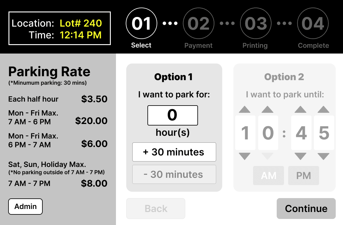
Starting screen when the user approaches the meter
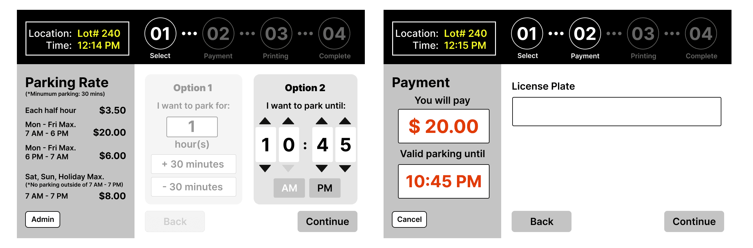
After selecting the time that the driver wants to park until, the next screen will show how much it costs.
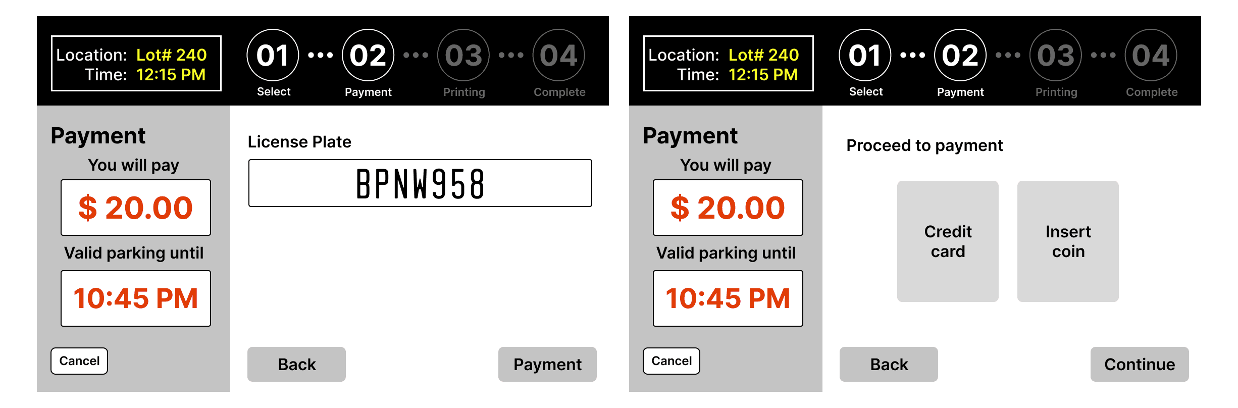
User will be able to review their license plate, and then select if they want to proceed with payment with credit card or cash.
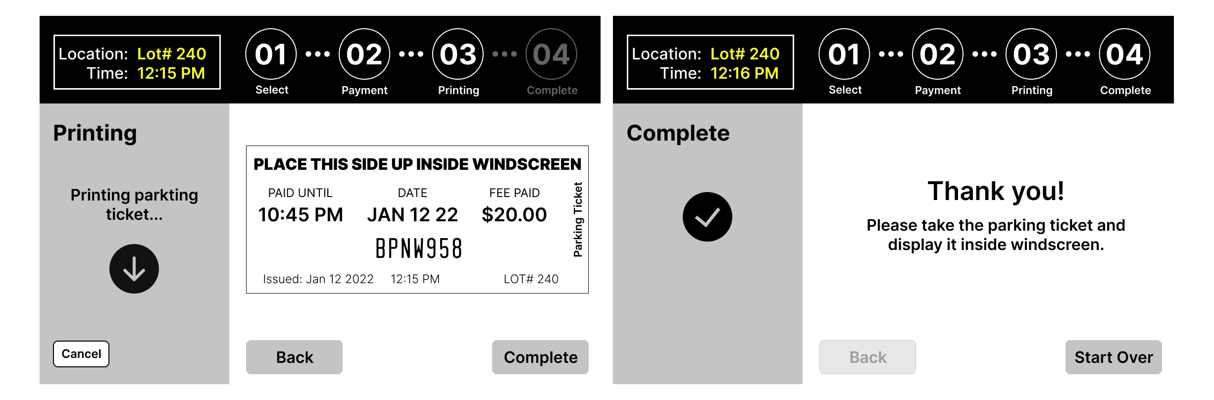
Displaying the actual ticket while printing the ticket can give the user a reminder and a sense of reassurance.
(*One of the responses I get is the user sometimes doesn't know if he or she should display the ticket or not because usually they just grab the ticket and leave.)
UI Design for parking attendants

Iterated UI Design for drivers
After reiterating the design, one more driver tested out the previous version and was confused if he could select Option 2 or not because Option 2 seemed disabled.

I added a description on top and made both visible to users. The number will change automatically according to the user's input.